
Processing Your Payment
Please do not leave this page until complete. This can take a few moments.
- News
-
Editions
-
- Lists
-
Viewpoints
-
Our Events
-
Event Info
- Women's Leadership Forum 2025
- On the Road with Mainebiz in Bethel
- Health Care Forum 2025
- On The Road with Mainebiz in Greenville
- On The Road with Mainebiz in Waterville
- Small Business Forum 2025
- Outstanding Women in Business Reception 2025
- On The Road with Mainebiz in Bath
- 60 Ideas in 60 Minutes Portland 2025
- 40 Under 40 Awards Reception 2025
- On The Road with Mainebiz in Lewiston / Auburn
- 60 Ideas in 60 Minutes Bangor 2025
Award Honorees
- 2025 Business Leaders of the Year
- 2024 Women to Watch Honorees
- 2024 Business Leaders of the Year
- 2023 NextUp: 40 Under 40 Honorees
- 2023 Women to Watch Honorees
- 2023 Business Leaders of the Year
- 2022 NextUp: 40 Under 40 Honorees
- 2022 Women to Watch Honorees
- 2022 Business Leaders of the Year
-
-
Calendar
-
Biz Marketplace
- News
- Editions
- Lists
- Viewpoints
-
Our Events
Event Info
- View all Events
- Women's Leadership Forum 2025
- On the Road with Mainebiz in Bethel
- Health Care Forum 2025
- On The Road with Mainebiz in Greenville
- On The Road with Mainebiz in Waterville
- + More
Award Honorees
- 2025 Business Leaders of the Year
- 2024 Women to Watch Honorees
- 2024 Business Leaders of the Year
- 2023 NextUp: 40 Under 40 Honorees
- 2023 Women to Watch Honorees
- 2023 Business Leaders of the Year
- + More
- 2022 NextUp: 40 Under 40 Honorees
- 2022 Women to Watch Honorees
- 2022 Business Leaders of the Year
- Nomination Forms
- Calendar
- Biz Marketplace
Unveiling of Maine Mariners logo launches merchandise sales for new hockey team
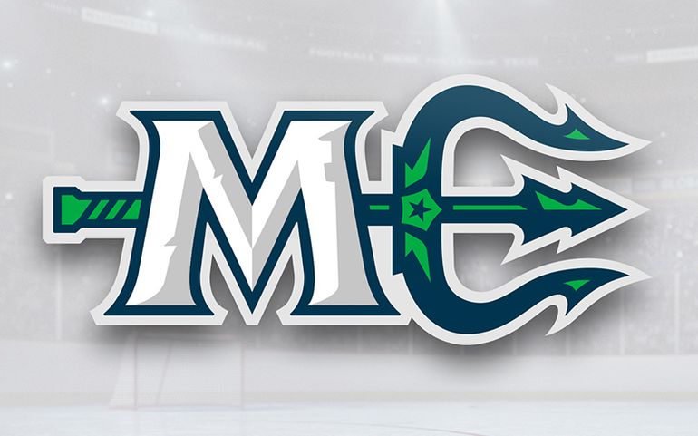 Courtesy / Maine Mariners
The new Maine Mariners hockey team unveiled its logo on Wednesday, a match-up of Neptune's trident with the state's abbreviation.
The future Maine Mariners hockey team became more real on Wednesday with the unveiling of a logo and the first T-shirt sales at the arena where they’ll be playing.
The logo got its first public showing at Portland’s Cross Insurance Arena less than a year before the ECHL brings hockey back to Maine at that venue starting next October.
Illuminating the scoreboard above real ice, the design is full of symbols that can be hard to spot at first: blue and green to represent Maine’s sea and forests, the Dirigo star from the state seal and flag, a pine tree and a lighthouse.
There’s also a trident meant to evoke myths of King Neptune, the god of the sea — it appears sideways to form the ‘E’ next to an ‘M’ in white (perhaps representing Maine snow or hockey ice?) for Maine’s ‘ME’ abbreviation.
Logo designed by Portland firm

“This logo is far from generic,” Adam Goldberg, the Mariners’ vice president of business operations, told the crowd sitting in the stands at lunchtime with complimentary hot dogs and chips. He said the design shows a connection both to Maine and the Portland region.
He later told Mainebiz that the design had gone through a number of tweaks along the way, referring to “one of those things … where you start with a broad array of logos and you whittle it down to what you want.” He had high praise for Big Room Studios, the Portland digital design and software engineering firm that came up with the logo.
Justin Varberakis, Big Room Studios’ creative director, said the logo took about a month to develop from start to finish, and marks his firm’s first foray into sports branding.
While the unveiling was greeted with applause by most fans present in the arena, some were upset about the absence of colors from the logo of the old Maine Mariners team.
“I wanted a little orange, but that’s just me,” lamented Jim Rogan, known to old-time hockey fans as the announcer for the old Maine Mariners team from 1977 to 1985.
Let the merchandising sales begin
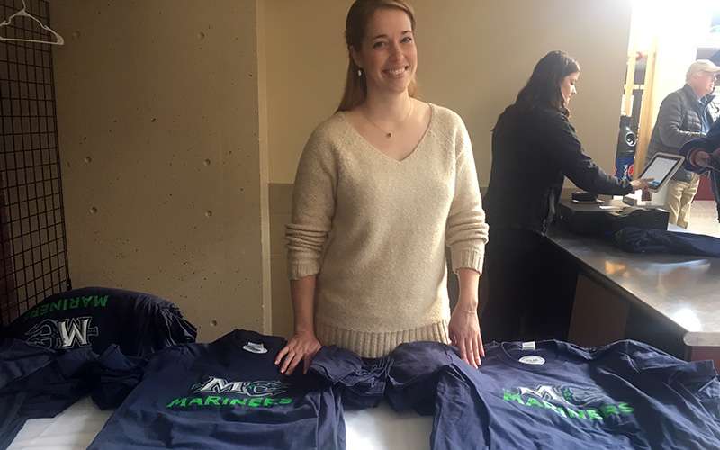
Hockey fans who can’t wait until the puck drops next fall are already Tweeting on the on the #1stOctoberYet hashtag and buying merchandise online, not just T-shirts but also Polo shirts, sweatshirts and outerwear. Fans are also welcome to take part in an evening “town meeting” at the Cross Insurance Arena scheduled for Dec. 12.
“It’s something that we did in my previous stop in Hartford, and it really seems to be well received for giving fans an opportunity to speak to us,” Goldberg explained. He said fans will be able to weigh in on “anything and everything, no holds barred, whatever they’d like.”
Asked when the team will unveil a mascot, Goldberg said that would be in a couple of months but noted that there are less mascot producers than there are designers.
“It’s eight to 10 weeks for production and we haven’t even gotten there yet,” he added.
As he was speaking, Goldberg was approached by a chap holding a sketchbook who said he had already come up an otter motif but would do some more work after seeing the new logo.
Portland has been without a pro hockey team since May 2016 but will get hockey back starting in the 2018-19 season after the ECHL, formerly the East Coast Hockey League, in June approved the transfer of a controlling interest in the Alaska Aces to Comcast Spectacor along with a move to Portland.




Comments